")
Are ecologists bias-free?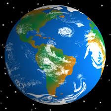
In thinking about landscape ecologies we usually forget the most important feature in their construction: Ourselves. Ecologists like to think of themselves as disinterested scientists collecting data to be presented in a bias-free way. In crafting a landscape of interacting variables we like to think or work is ethically neutral. As one demographer put it in a class I taught, "It's just numbers," that's what I do." But cartographers have long understood that the data we analyze and map are never truly neutral. Facts are what we make of them. “People who formulate those facts have to use assumptions: patterns of expectation within which they select, arrange, shape, and classify their data." (1)
This "culturalization of the natural," as Denis Wood calls it, can be seen in artist Tom Van Sandt's famous image of the world from space (Figure 1 top right), a carefully constructed portrait based on four-kilometer scans of the world from space. That doesn't mean the images are not "real." It only means that we construct the realities that seem natural. This image, like many are mediated, artistic interpretations of a benign, near cloudless, hopeful earth. Some have clouds, some do not. Most but not all are centered on the Americas (credit NASA).
Data doesn't speak
Data doesn't speak. Rather, like a ventriloquist's dummy, it mouths the arguments we seek to present. If the ecologies we construct are our constructions, creatures of our assumptions, then we are responsible for the messages they present. Others with similar ideas may choose different data to emphasize different aspects of the problem; others who disagree may choose different data and craft different solutions. That is the argument in my new book Ethics in Everyday Places: Mapping Moral Stress, Distress, and Injury. (4) There is ethical content in the ecologies we craft, the landscapes we create. This "landscape of responsibility" is most easily seen in maps of human behavior and urban structure.
Still smoking after all these years!
In teaching this I pose a seemingly simple scenario. Put yourself in the shoes of the map maker: The International Tobacco, LLC wants you to create a map of cigarette smokers over the age of 65 for an advertising campaign to be titled "Still Smoking after all these years!" Data for the map is from the U.S. Centers for Disease control, they say. Do you take the job knowing that carcinogens in tobacco are responsible for thousands of deaths a year? What about if your mother, father, or best friend died of tobacco related illness? And then, looking at the second image, how would you map the Anti-Tobacco League's campaign to get seniors to stop smoking? What's the difference between the two maps? You can't just change the title for these different clients. Any map of long-term smokers will link sustained tobacco to longevity. An anti-smoking map would use data on tobacco related mortality, with long-lived smokers the rare survivors.
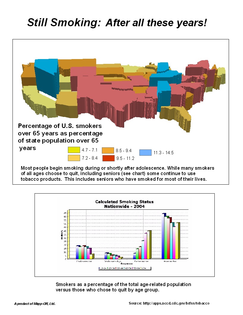
Figure 2 (bar graph) shows the advertising map of long-lived smokers as a "real," presentation of official data. But the landscape (of America) that results is false, equating tobacco use and longevity.
The revised London tube map of accessibility
Another example is the mapping of urban transit systems. Consider the iconic map of London's famous Underground, the tube system that in theory makes the city accessible to all. For more than 80 years, maps of London's Underground have served as a "magic guide to a hitherto totally bewildering city." (5) But for those in wheelchairs or with other mobility limits, the map is a lie. If you can't navigate the steep stairs at stops without wheelchairs or even escalators you can't get on, or off, the Tube.
To show the denuded landscape of mobility-limited transit I took the official map of the London Underground (6) and removed all the stops without "special access." I then removed all the transit lines connecting those inaccessible stops. The result is a denuded landscape in which 85 percent of the official network's stations are off the map for those with mobility limits. Both maps are "true," both are landscapes on which a whole series of commercial, political, and social ecologies can be added. The difference is that the official map is based on everyone having mobility. My version does not.
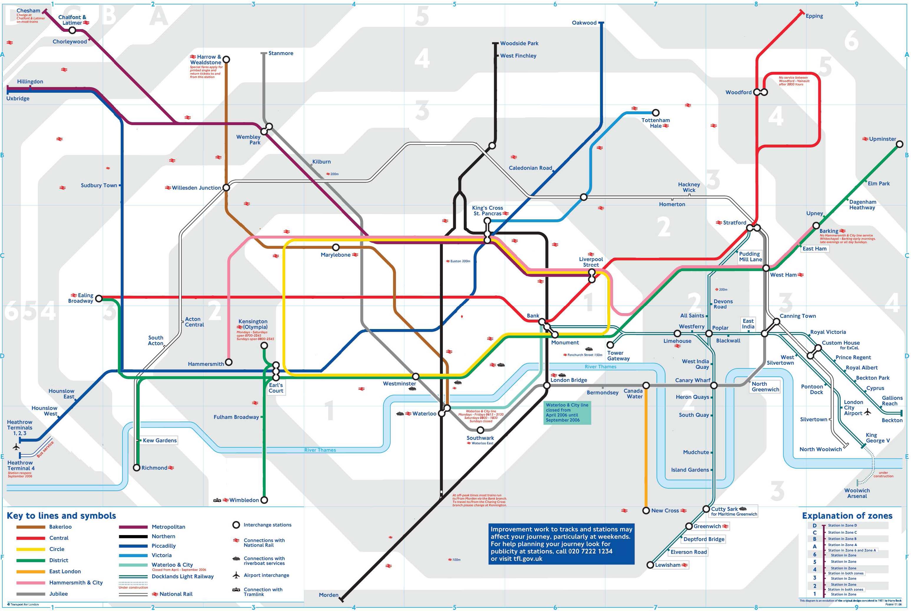
Figure 3 (above): shows a modified map of the London Underground from the perspective of a mobility-limited traveler. The promise of the official tube map, with all routes across Greater London is denied.
The ethics of maps
If you're a wheelchair user you may feel lousy about the official London Undergound map. If you're not a wheelchair user, perhaps we should be concered about how our fellow citizeans struggle to get about in the urban landscape we take for granted. And here's the ethics of it all: We're responsible for the maps we make and the official maps of the London underground hide the reality that affects us all, residents and visitors alike. In the United States more than 20 percent of all citizens over sixty-five reported staying home because of the limits of local transit systems. (7)
A call for action
By mapping as if everyone were equally nimble we hide the problem, and thus perpetuate it. By ignoring our responsibilities as citizens to critique the data we are given, seeking its limitations, we fail in our duty as citizens and as professionals with a responsibility to the greater picture. We fail as ecologists dedicated to understanding the interactions of varying components in a complex system. The beginning of an answer is to understand how much we embed our perspectives and our sensibilities in the works we create. For all our projects we need to accept that they carry our signature to a lesser or a greater extent. While we may be glad of the commission, we will be letting others down and feel lousy about the result. What fun is that?
References
1. Midgley, Mary. 2014. Are You an Illusion? NY: Rutledge, 3.
2. Wood, Denis. 1992. The Power of Maps. NY: Guilford Press, 51-54.
3. Wood, Denis and John Fels. 2008. The Natures of Maps: Cartographic Constructions of the Natural World. Chicago: University of Chicago Press.
4. Koch, Tom. 2017. Ethics in Everyday Places: Mapping Moral Stress, Distress, and Injury. Cambridge, MA: MIT Press.
5. Garland, Ken. 2003. Mr. Beck's Underground Map. Weald, Middlesex: Capital transport publishing, 25.
6. https://tfl.gov.uk/maps/track/tube.
7. Torres-Davis, Anna I. "The Need for Improved Transportation options for the Elderly and the Elder Advocate's Role." Journal of Poverty Law and Policy 42 (5-6): 281-291.
Professor Tom Koch principal work focus is the mapping of disease and more particularly the environmental (or social) factors that inhibit or promote its progress. More info about the author can be found at: http://www.geog.ubc.ca/persons/tom-koch/. Tom can be contacted at tomkoch@kochworks.com